Last updated for v0.8.7
¶ Foundry's style.css
Out of the box, Foundry provides a sizeable CSS framework. This article is intended to provide an overview of this framework so that system and module developers can leverage it - or avoid colliding with it - in their customizations.
¶ Viewing the CSS
To obtain or view the main style.css file:
- In your Foundry installation, the file can be found at
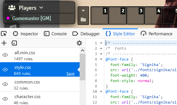
$installDirectory/resources/app/public/css/style.css - Using the Style editor in your browser's developer console, locate the file named
style.css:
¶ Flexbox Classes
Foundry provides a few general classes for employing CSS flexbox in your layouts.
If you're not familiar with flexbox, CSS Tricks has a solid guide here.
¶ flexcol
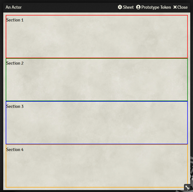
The flexcol class can be used on an HTML component so that it lays out its children vertically. The browser will attempt to distribute the height of all the children equally, down to their minimum. If the minimum heights of all the children exceed the component's height, then children will automatically flow to a new column.
¶ Example
{{!-- actor.hbs --}}
<form class="editable flexcol" autocomplete="off">
  <section style="border: 2px solid red"><p>Section 1</p></section>
  <section style="border: 2px solid green"><p>Section 2</p></section>
  <section style="border: 2px solid blue"><p>Section 3</p></section>
  <section style="border: 2px solid orange"><p>Section 4</p></section>
</form>
¶ flexrow
The flexrow class can be used on an HTML component so that it automatically lays out its children horizontally. The browser will attempt to distribute the width of all the children equally, down to their minimum. If the minimum widths of all the children exceed the component's width, then children will automatically flow to a new row.
¶ Example
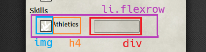
The following snippet shows a handlebars template for an ActorSheet implementation which contains a list of skills. For each Skill, there is an img, an h4 containing the name, and then a div which could contain buttons or other information.
{{!-- actor.hbs --}}
{{#each skills as |s|}}
<li class="flexrow">
  <img src="{{s.img}}" title="{{s.name}}" width="24" height="24" />
  <h4>{{s.name}}</h4>
  <div></div>
</li>
{{/each}}
The li has the flexrow class, so it will automatically place its child elements horizontally, in the order in which they appear in the code:
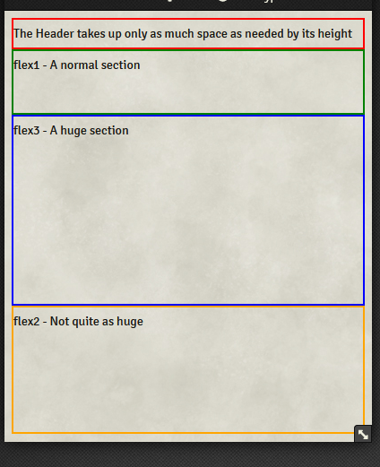
¶ flex0, flex1, flex2, flex3
These are shorthand classes for setting the flex-grow style of an element. By default, the elements within a flex container are distributed evenly; these classes provide a fast way to change the relative ratios of the elements within a flex container for when you want specific elements to take up more or less space within the container.
flex0- This element should not take up any more space than its fixed height or width.flex1- This element should attempt to take up 1 "unit" of space within the container. This is the default value for an element.flex2- This element should attempt to take up twice as much space as anyflex1elementsflex3- This element should attempt to take up three times as much space as anyflex1elements
Note that only the numbers
0 - 3are provided; an arbitraryflexNis not supported.
¶ Example
{{!-- actor.hbs --}}
<form class="flexcol" autocomplete="off">
  <header class="flex0" style="border: 2px solid red"><p>The Header takes up only as much space as needed by its height</p></header>
  <section class="flex1" style="border: 2px solid green"><p>flex1 - A normal section</p></section>
  <section class="flex3" style="border: 2px solid blue"><p>flex3 - A huge section</p></section>
  <section class="flex2" style="border: 2px solid orange"><p>flex2 - Not quite as huge</p></section>
</form>
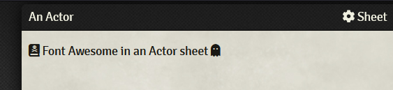
¶ Font Awesome
Foundry also includes the free Font Awesome icon font set.
¶ Example
<p>
  <i class="fas fa-book-dead"></i>
  Font Awesome in an Actor sheet
  <i class="fas fa-ghost"></i>
</p>
¶ Helper Utilities
¶ Class and ID extraction
Discord user danielrab#7070 in the League server wrote a python script to extract all IDs and classes used by the Foundry CSS.
The original message can be found here.
The python script:
import re

with open('style.css', 'r') as file:
    data = file.read()
print(data)
data = re.sub(r'\{[^{}]*\}', '', data)
data = re.sub(r'/[^\n]*\n', '', data)
data = re.sub(r'@[^\n]*\n', '', data)
data = re.sub(r',\n', '\n', data)

ids = sorted(list(set(re.findall(r'#([^\s#.]+)', data))))
classes = sorted(list(set(re.findall(r'\.([^\s#.]+)', data))))

with open('used ids.txt', 'w') as file:
    for i in ids:
        file.write(i+'\n')
with open('used classes.txt', 'w') as file:
    for c in classes:
        file.write(c + '\n')
and its output as of v0.8.7 on 16 June 2021:
Used Ids
- action-bar
- av-config
- board
- camera-views
- characters
- chat
- chat-controls
- chat-form
- chat-log
- chat-notification
- client-settings
- combat
- combat-controls
- combat-round
- combat-tracker
- compendium
- context
- context-menu
- controls
- controls-reference
- currently-playing
- drag-preview
- drawing-config
- entity-create
- error
- eula
- eula-content
- eula-sign
- eula-updated
- force-update
- game-details
- global-volume
- hotbar
- hotbar-directory-controls
- hud
- install-package
- join-game
- journal
- loading
- loading-bar
- logo
- macro-list
- manage-players
- menu
- menu-items
- module-management
- nav-toggle
- nav-toggle:hover
- navigation
- notifications
- pause
- permissions-config
- player-config
- player-list
- players
- playlists
- progress
- return
- scene-list
- scenes
- session-schedule
- settings
- setup
- setup-configuration
- sidebar
- sidebar-tabs
- token-drop
- token-hud
- update-channel
- update-notes
- world-config
- world-description
- world-title
Used Classes
- Error
- Success
- Warning
- action
- action-buttons
- active
- active-effect-sheet
- active:hover
- app
- attribute
- av-control
- avatar
- background
- banner
- bar
- bar-controls
- bar-data
- bar1
- bar2
- blind
- blindroll
- bottom
- broken
- bubble-content
- camera-box-dock
- camera-box-popout
- camera-size-large
- camera-size-medium
- camera-size-small
- camera-view
- camera-view-popout
- categories
- category
- center
- changes-list
- chat-bubble
- chat-control-icon
- chat-message
- chat-popout
- checkbox
- checkbox-label
- close
- col
- collapse
- collapsed
- color
- combat-cycle
- combatant
- combatant-control
- combatant-controls
- combatant:hover
- command
- compendium
- compendium-footer
- compendium-list
- compendium-pack
- content
- context
- context-item
- context-item:hover
- context-items
- control-bar
- control-buttons
- control-icon
- control-icon:first-child
- control-icon:hover
- control-tool
- control-tool:hover
- control-tools
- count
- create-entity
- create-folder
- crit
- css
- current-dir
- current-players
- d10
- d12
- d20
- d4
- d6
- d8
- dark
- default
- defeated
- description
- dialog
- dialog-buttons
- dice-flavor
- dice-formula
- dice-part
- dice-part:hover
- dice-result
- dice-roll
- dice-rolls
- dice-tooltip
- dice-total
- die
- dir
- directory
- directory-footer
- directory-header
- directory-item
- directory-item:last-child
- directory-list
- disabled
- disabled:hover
- discarded
- display-modes
- draggable
- drawn
- droptarget
- editor
- editor-content
- editor-edit
- editor:hover
- effect-change
- effect-change:last-child
- effect-control
- effect-control:hover
- effect-controls
- effects
- effects-header
- elevation
- emote
- encounters
- entity
- entity-link
- entity-name
- error
- error::before
- expand
- expand-down
- expand-up
- exploded:before
- fa
- fa-arrows-alt-v
- fa-external-link-square-alt
- fail
- failure
- fas
- file-picker
- filename
- filepicker
- filter
- filter-dir
- flavor-text
- flex0
- flex1
- flex2
- flex3
- flexcol
- flexrow
- folder
- folder-header
- form-fields
- form-group
- form-group-stacked
- form-header
- global-control
- gm
- gmroll
- grid-label
- header
- header-search
- hidden
- hint
- hotkey-list
- hover
- ic
- image-popout
- images-list
- inactive
- inactive:hover
- index
- info
- info::before
- initiative
- inline-roll
- inline-roll:hover
- install
- installed
- item
- javascript
- join-footer
- journal
- journal-sheet
- key
- keys
- languages
- left
- lightbox-image
- list-filters
- local-camera
- lock-result
- lock-toggle
- locked
- macro
- macro-icon
- macro-key
- macro-sheet
- macro:hover
- max
- mce-btn
- mce-btn:hover
- mce-ico
- mce-panel
- mce-top-part
- mce-top-part::before
- message
- message-content
- message-header
- message-metadata
- message-sender
- middle
- min
- minimized
- mode
- module-header
- name
- nav-item
- no-video
- noborder
- notes
- notification
- notification-bar
- notification-pip
- notification::before
- overlay
- pack-title
- package
- package-controls
- package-description
- package-footer
- package-list
- package-metadata
- package-overview
- package-tags
- package-title
- package-url
- package:last-child
- packages
- packages-loading
- page-control
- page-number
- part-flavor
- part-formula
- part-header
- part-total
- paused
- pct
- permission
- permissions-list
- picked
- picker
- placeable-hud
- player
- player-active
- player-name
- players-hidden
- players-mode
- playlist
- playlist-header
- playlist-name
- playlist-sounds
- privacy
- private
- profile
- progress-bar
- public
- range-value
- requires
- reroll
- rerolled
- result-controls
- result-details
- result-image
- result-range
- result-target
- result-text
- result-type
- result-weight
- right
- roll
- roll-table-config
- roll-type-select
- roll:hover
- roulette
- scene
- scene-control
- scene-control:hover
- scene-notes
- scene-player
- scene-players
- scene-sheet
- scene:last-child
- secret
- selected-file
- self
- sep
- settings-list
- setup-footer
- sheet
- sheet-footer
- sheet-header
- sheet-tabs
- show
- sidebar-popout
- sidebar-tab
- sound
- sound-control
- sound-controls
- sound-playback
- sound-timer
- speaking
- stacked
- status-effects
- status-hidden
- status-icons
- status-muted
- stream
- subdirectory
- subdirectory:empty
- submenu
- success
- tab
- tab[data-tab]
- table-description
- table-draw
- table-header
- table-result
- table-result:last-child
- table-results
- tabs
- tag
- thumbs-list
- tile-size
- tiles-list
- title
- toggle
- toggle:hover
- token-effect
- token-effects
- token-image
- token-initiative
- token-name
- token-resource
- token-sheet
- tooltip
- tox
- tox-edit-area__iframe
- tox-tbtn
- tox-tbtn[title="Formats"]
- tox-tinymce
- tox-toolbar
- unavailable
- units
- unknown
- unlock
- update
- update-notes
- updated-packages-table
- upload-file
- user-avatar
- user-camera
- user-config
- user-delete
- value
- video-container
- video-container::before
- video-containers
- view
- visibilities
- visibility
- vol-max
- vol-min
- volume-bar
- volume-icon
- warning
- warning::before
- watermark
- webrtc-dock-camera-container
- webrtc-dock-empty
- whisper
- whisper-to
- window-app
- window-content
- window-header
- window-resizable-handle
- window-title
- world-desc
- zhover