¶ Dialog

¶ Overview
Dialogs are most useful for quick prompts and simple forms which do not re-render their contents as inputs or other data changes (as compared to FormApplication which is well-suited for more advanced forms).
The API documentation for the DialogData and DialogButton types are useful references throughout this.
¶ Key Concepts
Dialog extends the Application class.
¶ Dialog Contents
Unlike the other Application ancestors, Dialogs have a hardcoded handlebars template and getData method.
It is expected that the content of the Dialog be passed to the Dialog constructor in the form of a static HTML string. Dialogs do not re-render if their content changes.
¶ Buttons
Dialogs have an API for handling user input in the form of buttons. It is recommended to use these buttons instead of including your own in your content.
¶ Promise or Callback
There are essentially two ways to interact with the Dialog api: by wrapping the Dialog in a Promise, or by leveraging the callbacks of the buttons.
Neither way is more correct, both are useful patterns in different circumstances.
¶ Promise
Useful for long-running processes which return promises themselves that other API functionality awaits.
async function someDangerousProcess() {
  const confirmation = await Dialog.prompt({
    content: "Are you sure?"
  });

  if (!confirmation) {
    return;
  }

  // something like a Document update happens
}
More examples of wrapping Custom Dialogs with promises in the Specific Use Cases section below.
¶ Callback
Useful for operations that are not awaited by other API areas and may be easier to follow without understanding the inner workings of Dialog.
function informUser() {
  Dialog.confirm({
    content: "These are the results of your inquiry: 42",
    callback: () => {
      // do something when button is clicked
      // Like all callbacks, you can provide a function here
      // instead of doing this inline with an anonymous arrow function
    },
  })
}
¶ Dialog Template
The actual template used for dialogs is quite simple:
<div class="dialog-content">
    {{{content}}}
</div>
<div class="dialog-buttons">
    {{#each buttons as |button id|}}
    <button class="dialog-button {{cssClass}}" data-button="{{id}}" {{disabled button.disabled}}>
        {{{button.icon}}}
        {{{button.label}}}
    </button>
    {{/each}}
</div>
¶ API Interactions
There are three ways to display a Dialog:
- Providing
dataandoptionsto theDialogclass constructor for fully custom Dialogs - Using the
Dialog.promptfactory method for simple notifications - Using the
Dialog.confirmfactory method for Yes/No confirmations
¶ Dialog Constructor arguments
The Dialog constructor takes two arguments:
datawhich is passed to the Dialog's rendered templateoptionswhich is passed up to the parent Application rendering options
¶ data Fields
These fields are configurable on the first argument (data) for the Dialog constructor.
¶ data.title
A static string that will be displayed in the Application's title area. Defaults to "Dialog".
¶ data.content
A static string which is rendered in the content area of the Dialog. HTML tags will not be escaped when rendering content of a Dialog as it is rendered with Handlebars' built-in 'triple-stash' expression.
¶ data.buttons (required)
To create a dialog with no buttons, provide an empty object.
Dialogs allow buttons to be registered for display and interactivity. Buttons are registered in the form of an object keyed by button "name" with values being an object with these properties:
| Name | Type | Attributes | Description |
|---|---|---|---|
| icon | string | optional | An HTML element that preceeds the button label. Convention is to use Fontawesome icons |
| label | string | The label for the button | |
| disabled | boolean | optional | Whether the button is disabled |
| callback | function | optional | A callback function that fires when the button is clicked, the Dialog's html at the time of button click is provided as argument |
function handleFoo(dialogHtml) {
  // do something
}

const buttons = {
  foo: {
    icon: '<i class="fas fa-dice-d20"></i>',
    label: 'Foo'
    callback: handleFoo;
  },
  bar: {
    label: 'Bar'
  }
};
By default when any button is clicked the Dialog's close method will fire and the Dialog will exit.
¶ data.default
Passing the "name" or key that identifies of one of the defined buttons will style that button as the "default" button and make pressing the "enter" keyboard key fire that button's callback.
If the button indicated has no callback, an error will be thrown.
¶ data.render(html)
The provided render callback is fired immediately after the Dialog is created during the Application#activateListeners method. This allows any listeners that the contents might warrant to be registered.
The Dialog's html at the time of rendering is provided as argument.
¶ data.close(html)
Interrupting the Dialog close process can be done by throwing an error in the close callback but this is not the recommended way. See Preventing Dialog Close for more information.
The provided close callback is fired while the Dialog is closing before the Application#close method.
The Dialog's html at the time of closing is provided as argument.
¶ Application options
The second argument passed to the Dialog constructor is passed on to Application as its constructor options.
¶ Example
new Dialog({
  title: "This is a custom Dialog!",
  content: "With custom content.",
  buttons: {
    buttonA: {
      label: "A Button",
      callback: () => {}
    },
    no: {
      label: "No",
      callback: () => {}
    }
  },
    default: 'buttonA',
}).render(true)

¶ Helper Factories
The Dialog.prompt, Dialog.confirm, and Dialog.wait methods are helper factory methods which provide abstractions for the two most common Dialog use cases.
¶ Dialog.prompt
The prompt factory method returns a Promise which resolves when the user makes a selection or rejects if the user closes the dialog (configurable to instead resolve with null).
The Promise resolves with the value output by the provided callback function, if defined. If there is no callback defined, an error is thrown.
¶ Optional config fields
| Field | Type | Dialog Data Equivalent | Description |
|---|---|---|---|
title |
string | data.title |
The confirmation window title |
content |
string | data.content |
The confirmation message |
label |
string | data.buttons['ok'].label |
The confirmation button text |
callback |
function | data.buttons['ok'].callback |
A callback function to fire when the button is clicked |
render |
function | data.render |
A function that fires after the dialog is rendered |
rejectClose |
boolean (default: true) |
n/a | Reject the promise if the dialog is closed without confirming the choice, otherwise resolve as null |
options |
ApplicationOptions |
options |
Additional rendering options passed to Application |
¶ Example
Dialog.prompt({
  title: "Something Happened",
  content: "I hope you're ok with that.",
  label: "I am",
  callback: (html) => { /* do something or return value */ }
})

¶ Notes about callback
The button callback can be an asynchronous operation. The resolved value from that Promise is bubbled up to the prompt Promise resolution.
const response = await Dialog.prompt({
  title: "Something Happened",
  content: "I hope you're ok with that.",
  label: "I am",
  callback: async (html) => { return 'foo' },
});

console.log('responded', response); // expects 'foo' when the button is pressed
¶ Dialog.confirm
The confirm factory method returns a Promise which resolves when the user makes a selection or rejects if the user closes the dialog (configurable to instead resolve with null).
The Promise resolves with the value output by the provided yes or no callbacks, if defined. These button callbacks can be asynchronous same as the callback option in Dialog.prompt. If there is no callback defined, true is returned for "yes" and false for "no".
¶ Optional config fields
| Name | Type | Dialog Data Equivalent | Description |
|---|---|---|---|
title |
string | data.title |
The confirmation window title |
content |
string | data.content |
The confirmation message |
yes |
function | data.buttons['yes'].callback |
Callback function upon yes |
no |
function | data.buttons['no'].callback |
Callback function upon no |
render |
function | data.render |
A function to call when the dialog is rendered |
defaultYes |
boolean (default: true) |
n/a | Make "yes" the default choice? |
rejectClose |
boolean (default: false) |
n/a | Reject the Promise if the Dialog is closed without making a choice. |
options |
ApplicationOptions |
options |
Additional rendering options passed to the Dialog |
¶ Example
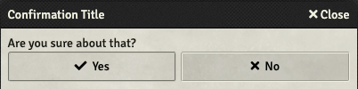
Dialog.confirm({
  title: "Confirmation Title",
  content: "Are you sure about that?",
  yes: (html) => { /* do something or return value */ },
  no: (html) => { /* do something or return value */ },
})
¶ Dialog.wait
Foundry provides a built-in method to handle dialogs as a promise, allowing you to await the output.
This is useful in situations where a quick prompt for user input is desired in an asynchronous process.
const dialogOutput = await Dialog.wait({
  title: "A custom dialog title",
  content: "Some content for your dialog.",
  buttons: {
    foo: { label: "foo", callback: () => ( 'foo' ) },
    bar: { label: "bar", callback: () => ( 'bar' ) },
  },
  close: () => { reject() }
});


console.log(dialogOutput); // logs based on the button clicked
¶ Specific Use Cases
¶ Using Handlebars for Content
The content of a Dialog expects a string that can be safely rendered as HTML. It's possible to use handlebars to construct this html string by passing the output of a renderTemplate call to the Dialog constructor.
Note that this will not re-render with new data like the core DocumentSheets do without additional jerry-rigging. It's generally advisable to use a custom Application or FormApplication if such interactivity is desired.
const contentHtml = await renderTemplate('path/to/template.hbs', data);

new Dialog({
  title: "A custom dialog title",
  content: contentHtml,
  buttons: {
    foo: { label: "foo" },
    bar: { label: "bar" },
  },
}).render(true);
¶ Getting Form Inputs on Submit
The callback of a Dialog button gets the html of the dialog as its argument. From this, it is possible to read the state of form elements within the Dialog content when it is submitted.
Foundry Core includes the helper class FormDataExtended to help with this.
Note: In Foundry v12, FormDataExtended drops the toObject method used below and simply supplies the object as a property called .object.
// this could be the output of renderTemplate to use handlebars
const form = `<form>
  <label>Input 1 <input name="input-1" type="string"/></label>
</form>`;

function handleSubmit(html) {
  const formElement = html[0].querySelector('form');
  const formData = new FormDataExtended(formElement);
  const formDataObject = formData.toObject();

  // prints an object: { input-1: 'some value' }
  console.log('output form data object', formDataObject);
}

new Dialog({
  title: "A custom dialog title",
  content: form,
  buttons: {
    submit: { label: "Submit", callback: handleSubmit },
    cancel: { label: "Cancel" },
  },
}).render(true);
Here's an alternate method that uses Dialog.wait and an anonymous arrow function:
// this could be the output of renderTemplate to use handlebars
const form = `<form>
  <label>Input 1 <input name="input-1" type="string"/></label>
</form>`;

const formResult = await Dialog.wait({
  title: "A custom dialog title",
  content: form,
  buttons: {
    submit: { label: "Submit", callback: (html) => {
      const formElement = html[0].querySelector('form');
      const formData = new FormDataExtended(formElement);
      const formDataObject = formData.toObject();
      return formDataObject;
    }},
    cancel: { label: "Cancel" },
  },
});

// If submit was entered, this will print an object of the form { input-1: 'some value' }
// If cancel was entered, there is no callback defined
// Thus this will print the key of the button; in this case, `cancel`
console.log('output form data object', formResult);
¶ Preventing Dialog Close
In cases involving Dialogs which gather user inputs, it might be desired to prevent the dialog from closing in some circumstances. There are two ways to accomplish this:
¶ Throw an Error in the close function
This is not recommended as it is possible to get the user into a state where there is no way to dismiss the dialog, which is very user-unfriendly.
Additionally, there is no feedback given to the user why the dialog fails to close as the error is only logged to the console.
This does not prevent the button callbacks from firing.
new Dialog({
  title: "An Unclosable Dialog",
  content: "You can open it, but you can never close it.",
  buttons: {
    submit: { label: "Submit", callback: () => { console.log('User tried to submit') }},
    cancel: { label: "Cancel" },
  },
  close: () => { throw new Error('You cannot leave here!'); }
}).render(true);
¶ Throw an Error in a button callback
A much more user-friendly way to prevent submission of the dialog is to throw an error in a button callback.
These errors are displayed to the user in the form of UI Notifications by default.
new Dialog({
  title: "A custom Dialog",
  content: "You cannot submit it, but you can close it.",
  buttons: {
    submit: { label: "Submit", callback: () => { throw new Error('Submission invalid!') }},
    cancel: { label: "Cancel" },
  },
}).render(true);
¶ Activating listeners on the Content Elements
In some cases, it is valuable to register event listeners on the elements within the rendered dialog to provide more interactivity than buttons or native form elements allow.
The render callback provides the rendered Dialog as a jQuery object as parameter.
const htmlContent = "<div>Click here for more Details: <button type='button' class='custom-button'>Details</button></div>";

function handleRender(html) {
  html.on('click', 'button.custom-button', () => { /* do something */ });
}

new Dialog({
  title: "A custom Dialog",
  content: htmlContent,
  buttons: {
    done: { label: "Done" },
  },
  render: handleRender,
}).render(true);
¶ Custom Dialog Subclass
Creating a subclass of Dialog allows for considerably more control over every aspect of the Dialog. This is useful for more complex cases. Since Dialog inherits from Application, all of the normal ways to interact with an Application are available.
This is also a common method for creating a custom factory method when some default Application options for the Dialog would be easier to override in one place (e.g. classes to help with styling).
class GreetingDialog extends Dialog {
  constructor(dialogData = {}, options = {}) {
    super(dialogData, options);
    this.options.classes = ['my-custom-class-name'];
  }

  /**
   * A custom dialog factory for our use case.
   * @param {object} options
   * @param {string} options.name - The name of whoever we are greeting
   * @returns {Promise}
   */
  static async create(options) {
    return new Promise(resolve => {
      new this({
        title: `A custom dialog named: ${options.name}`,
        content: `Hello ${options.name}`,
        buttons: {
          hello: { label: "Hello!", callback: () => { resolve(true) }}
        },
        close: () => { resolve(false) }
      }).render(true);
    });
  }
}

// ...

const noticeMe = await GreetingDialog.create({ name: "Steve" });

if (noticeMe) {
  console.log("Steve likes me!");
} else {
  console.log("Steve doesn't like me.");
}
¶ Troubleshooting
¶ Custom Dialog does not appear
When creating a custom Dialog, it is important to call the render method of the instanciated Dialog (inherited from Application#render) with the true argument.
const customDialog = new Dialog({ ... });

customDialog.render(true);
¶ One Big Example
The following example demonstrates the following all at once:
- Promise that resolves when submitted
- Uses handlebars to create the contents
- Gathers user inputs on submission
- Prevents submission if the inputs are invalid
- Implements a custom listener to enable some other functionality
Gif Demonstration of the Result

¶ handlebarsTemplate.hbs
  <form>
    <div class="flexrow">
      <div class="flexcol">
        <h3>
          Presets
        </h3>

        <button data-preset="apple" type="button">
          Apple
        </button>

        <button data-preset="banana" type="button">
          Banana
        </button>

        <button data-preset="orange" type="button">
          Orange
        </button>
      </div>

      <div class="flexcol">
        <label>
          Name
          <input type='text' name='name' />
        </label>

        <label>
          Color
          <input type='color' name='color' />
        </label>
      </div>
    </div>
  </form>
¶ fruitPrompt.js
/**
 * Sets the form's inputs based on the selected preset.
 */
function handleFruitPreset(event) {
  const targetElement = event.currentTarget;
  const presetType = targetElement.dataset?.preset;

  const formElement = $(targetElement).parents('form');

  const nameInput = formElement?.find('[name="name"]');
  const colorInput = formElement?.find('[name="color"]');

  if (!presetType || !nameInput || !colorInput) {
    return;
  }

  switch (presetType) {
    case 'apple':
      nameInput.val('Apple');
      colorInput.val('#ff0000');
      break;

    case 'banana':
      nameInput.val('Banana');
      colorInput.val('#ffff00');
      break;

    case 'orange':
      nameInput.val('Orange');
      colorInput.val('#ff7700');
      break;

    default:
      throw new Error(`Unknown preset: ${presetType}`);
      break;
  }
}

/**
 * Verify that all expected formData fields have values.
 */
function verifyFruitInputs(formData) {
  if (!formData?.name) {
    throw new Error('Name is required');
  }

  if (!formData?.color) {
    throw new Error('Color is required');
  }
}

/**
 * Prompt the user for traits they wish the created fruit to have.
 */
async function promptForFruitTraits() {
  const htmlContent = await renderTemplate('handlebarsTemplate.hbs');

  return new Promise((resolve, reject) => {
    const dialog = new Dialog({
      title: "Fruit Traits",
      content: htmlContent,
      buttons: {
        submit: {
          label: "Create",
          icon: '<i class="fas fa-apple-alt"></i>',
          callback: (html) => {
            const formData = new FormDataExtended(html[0].querySelector('form'))
              .toObject();

            verifyFruitInputs(formData);

            resolve(formData);
          },
        },
        skip: {
          label: "Skip",
          callback: () => resolve(null),
        },
        cancel: {
          label: "Cancel",
          callback: () => reject('User canceled.'),
        },
      },
      render: (html) => {
        html.on('click', 'button[data-preset]', handleFruitPreset);
      },
      close: () => {
        reject('User closed dialog without making a selection.');
      },
    });

    dialog.render(true);
  });
}

// ...

// create a fruit
try {
  const fruitTraits = await promptForFruitTraits();

  if (!fruitTraits) {
    console.warn('User skipped fruit creation.')
  } else {
    console.log(fruitTraits); // logs the form output
  }
} catch(error) {
  console.error(error);
}